Connecting to a Host
The Configurator edits hardware and mappings through a JIB host (the JIB.Service process). Most tabs are disabled until the Configurator is connected to one.
The connection controls live in the top header, next to the JIB badge.
To connect:
- In the header, open the endpoint field.
- Pick a host from the discovered endpoints list (hosts found through UDP discovery appear automatically), or
- Type the host address manually as
host:port, for example127.0.0.1:16550.
- Click
Connect.
The host listens on TCP port 16550 by default, so 127.0.0.1:16550 connects to a host running on the same machine.
The endpoint field remembers the last successful endpoint and pre-fills it on the next launch.
Connection states:
Connecting: the button becomesCancelwhile the connection is attempted;Connected: a green status chip showsConnected to <endpoint>, a session summary and aDisconnectbutton appear, and the host-dependent tabs (Controls,Devices,Plugins,Datas,Settings,Transports,Logs) become enabled;Error: a red status shows what failed.
Common connection failures and what to check:
Invalid format. Use host:port: the endpoint is not inhost:portform;Connection timed outorHost unreachable: the host is not running, is on another machine without LAN access, or the address is wrong;Connection failed: the endpoint answered but the host handshake did not succeed.
Check the Infos tab to confirm the connection state, the active host, and the discovered hosts on the network. Use Disconnect in the header to close the session.
Settings tab) and the machine must be reachable. See the Architecture page for the full picture.
Controls Tab
The Controls tab is where you author what each physical control on a device does.
Use it to configure:
- what a button, screen, touch area, or other rendered control displays;
- which input event triggers a mapping;
- which actions run when that event happens;
- scene, page, folder, touch-page, LED, and activation behavior for the selected device.
The normal authoring flow is:
- Select a device from
Device. - Select the scene and page you want to edit.
- Select a control in the
Canvas. - Assign a display source from the
Palette, if the control can render content. - Add an event slot, such as
Press,Long press,Increment, orSwipe left. - Add one or more actions to that event.
- Watch the global save state in the Configurator header and save when changes are pending.
After a control is selected, the Selected control panel below the canvas exposes, in order, Press behavior (buttons), Display (render overrides), Knob behavior (knobs), and Triggers and actions (event slots and action cards).
Quick Start
This quick start creates a basic button with one display and one action.
- Open
Controls. - Select the target box in
Device. - Select the scene and page you want to edit.
- Click a button in the
Canvas. - In the
Palette, expand a provider, open a source group card, then drag one display source field onto the selected button. - Drag
PressfromEventsonto the same button or intoTriggers and actions. - Select the
Pressevent slot if it is not already selected. - Drag an action provider from
Actionsinto thePressevent. - Expand the action card if it needs parameters.
- Save from the global Configurator header when the save chip reports pending changes.
Expected result: the button shows the selected display source and runs the configured action when the Press event is triggered.
Screen Layout
The Controls tab has three working columns.
Left Column
The left column selects the editing context.
Scenes manages scene-level layouts for the selected device.
Available scene operations:
- create a scene with
+; - delete the selected scene when deletion is allowed;
- make the selected scene the default scene;
- lock or unlock the selected scene;
- rename a scene by double-clicking its name.
Scene cards carry badges: Default, Auto (has activation rules), and Locked.
Pages manages the pages and folders inside the selected scene.
Available page operations:
- create a page with
+; - create a folder from the current page (folder icon), when the device supports folders;
- delete the selected page or folder when deletion is allowed;
- make the selected page the home page;
- export or import the page mappings;
- rename a page by double-clicking its name.
Page cards carry an item-type chip (Page or Folder) and a Home badge. Folders are entered from the page list; a back breadcrumb in the Canvas header returns to the parent page.
Touch pages appears only when the selected device and page support touch-page editing. Touch pages belong to the selected main page.
Available touch-page operations:
- create a touch page with
+; - delete the selected touch page when at least one valid touch page remains;
- make the selected touch page the home touch page;
- rename a touch page by double-clicking its name.
Activation lets a scene become active automatically when a process is running or focused.
For each activation rule:
- add one or more programs with
Add program(browse for a.exe,.com,.bator.cmdfile) or by dropping a file onto the rule card; - remove a program individually with its delete button;
- enable
Require focuswhen the scene should activate only while a listed program is focused; - enable or disable the rule with
Rule enabled; - remove the rule with
Delete rule.
The scene activates when any listed program matches. You can also drop a program file onto the Activation panel to create a new rule pre-filled with that program.
Center Column
The center column is the main authoring area.
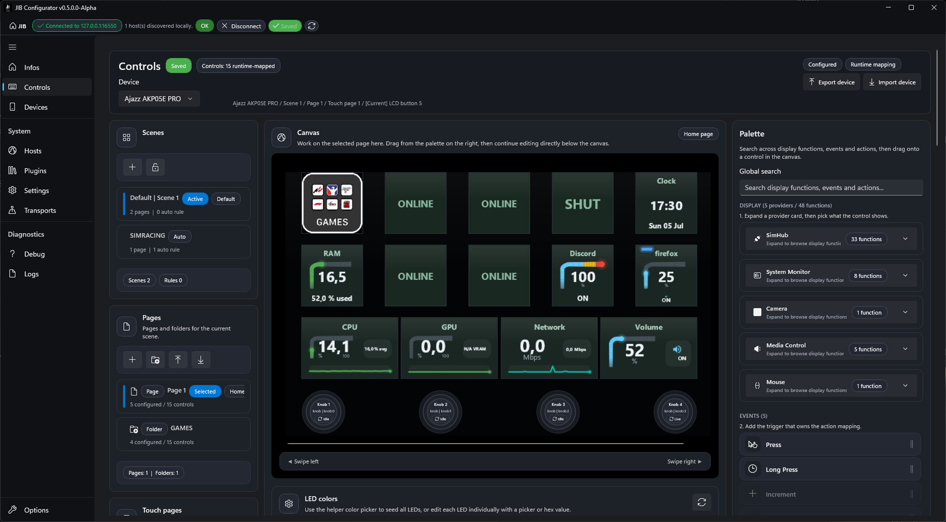
Canvas shows the selected device surface. It is the preferred place to select a control and to drop display sources, events, actions, images, programs, or existing assignments. A breadcrumb and a back button in the header track folder navigation. The canvas also hosts the device backdrop button and the LED colors editor.
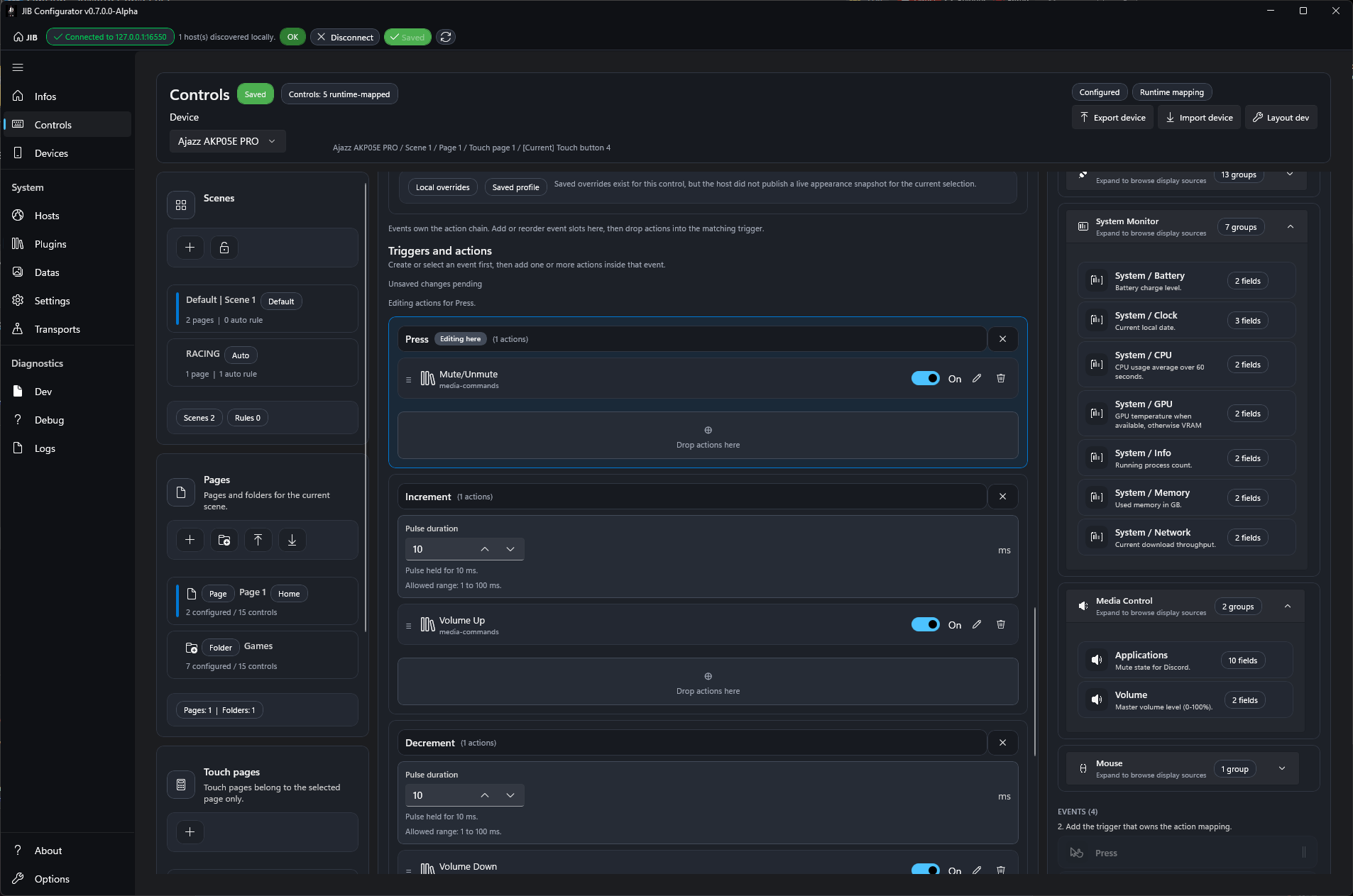
Selected control appears after a control is selected. It contains the editors that apply to that control: Press behavior, Display, Knob behavior, and Triggers and actions.
Right Column
The right column contains the Palette.
The palette is split into:
Display: runtime display sources exposed by providers, grouped per provider and per source group;Events: event slots supported by the selected control;Actions: executable actions exposed by mapping providers.
The Global search field filters display sources, events, and actions at the same time. Results stay grouped by section, and the palette shows a numbered hint (1. pick a display source, 2. add the trigger, 3. drag an action).
Screenshots
The full Controls tab combines the context selectors, device canvas, selected-control editor, and palette in one workspace.
The selected-control area is where display, events, actions, and control-specific behavior are edited after a canvas selection.
Device Selection
Start by selecting a device in the Device combo box.
If Controls is disabled, the Configurator is not connected to a host. If the device list is empty, check the Devices tab and the physical USB connection.
Each device owns its own complete layout, independent from every other box. The hierarchy is:
Box
› Scene (scene-1, scene-2, …)
     › Page (page-1, page-2, …)
     ¦    › Touch pages (touch-1, touch-2, …)
     › Folder
Scenes, pages, touch pages, folders, mappings, and scene-activation rules are all scoped to the selected box. Editing a scene or page on one box never affects another box, even if two boxes happen to use the same scene or page name.
The header chips show the current save state, the loaded controls summary, and the selected control status/source when a control is selected. The header also hosts the device-level Export device and Import device actions.
Canvas
The Canvas represents the physical facade of the selected device. Click a rendered button, knob, touch area, swipe affordance, or other visible control to select it.
When a control is selected, the Selected control panel updates below the canvas.
The canvas accepts these drag-and-drop operations:
- drag a display source from the palette onto a control to assign what it displays;
- drag an
Eventfrom the palette onto a compatible control to create that event slot; - drag an
Actionfrom the palette onto a compatible control to add it to the selected or resolved event slot; - drag an existing configured control assignment to another control to move or swap assignments;
- drop an image file onto a rendered control to assign a static display image;
- drop a supported program file onto a control to create a program launch action.
Supported image drops include common image files such as png, jpg, jpeg, bmp, and webp.
Supported program drops include exe, com, bat, and cmd.
Rendered controls that support two channels show separate Primary and Secondary drop zones during a display-source drag (touch buttons split left/right; other buttons split top/bottom). Dropping a display source assigns only the targeted slot, so primary and secondary can point to different provider sources.
The canvas also shows a camera button in the top-left corner of the device backdrop (touchscreen background area) to set or clear the page background image. See Background Image.
Canvas Context Menu
Right-click a control (button, knob, touch area, or swipe control) in the canvas to open its context menu.
Available actions:
Export mapping...: export the selected control mapping to a file;Import mapping...: import a mapping file into the selected control;Set display image...: choose an image file and use it as the control's static display;Clear display: remove the display assignment without clearing the event mapping;Clear mapping: clear both display and event/action mapping for the control.
Use Clear display when you only want to remove what the control shows. Use Clear mapping when you want to remove the control assignment itself (action slots, display bindings, render profile, and behavior).
Background Image
Each page can show a background image on the touchscreen/display area. The background is edited directly from the canvas.
Set or change a background image:
- Right-click the device backdrop (the touchscreen background area) and choose
Set background image..., or - Click the camera button in the top-left corner of the backdrop, then choose
Set background image....
The backdrop context menu offers:
Set background image...: choose an image for the current page background;Set background image for all pages...: apply the image to every non-hardware page at once;Clear background image: remove the background image for the current page;Clear background image for all pages: remove the background image from every page.
The page background is a runtime layout image, saved with the page. It is distinct from the persistent Startup background written to the box ROM in the Devices tab, which survives a device reboot.
Touch Pages
Touch pages are scoped to the selected main page. Changing the main page changes the available touch pages.
A touch page can be selected from the left Touch pages panel. On compatible layouts, the canvas also shows a touch-page strip under the preview surface.
Important behavior:
- selecting a touch page changes the touch surface being edited;
- creating a touch page selects it;
- deleting a touch page selects a valid remaining touch page;
- setting a touch page as home affects only the current main page;
- renaming a touch page does not move it to another main page.
Touch pages are not folders. A folder is a local navigation sub-page. A touch page is an alternate touch surface attached to the active main page.
Swipe Controls
On devices that expose swipe input, the canvas shows Swipe left and Swipe right.
Both gestures belong to the same logical swipe control, but they target different event slots:
Swipe leftmaps toDecrement;Swipe rightmaps toIncrement.
Clicking Swipe left or Swipe right selects the shared swipe control and focuses the matching gesture in the mapping editor.
It does not change the active touch page. Touch-page navigation is done through the touch-page selector or through runtime navigation actions.
The swipe control is scoped per touch page: each touch page has its own swipe mapping, so you can assign different Swipe left / Swipe right actions on each touch page.
Selected Control
The Selected control panel is shown after a control is selected from the canvas.
It follows this order:
Press behavior, when the control is a button or touch button.Display, when the control supports appearance/render settings.Knob behavior, when the selected control is a knob.Triggers and actions, when the control supports editable mappings.
Sections appear only when they apply to the selected control.
Press Behavior
Press behavior appears for buttons and touch buttons that support configurable press behavior.
Available modes:
Selection: pressing the button only changes the current selection.Selection + event: pressing the button changes selection and dispatches its event mappings.Event: pressing the button dispatches mappings without changing selection.Select, then event: the first press selects the button; later presses dispatch mappings while it stays selected.
Use Selection + event for a button that should both become the active editor context and run its mapping. Use Event when pressing the button should only execute behavior.
Display
Display controls the local visual output of the selected rendered control.
The recommended starting point is to drag a display source from the palette onto a control in the canvas. After that, edit the resulting render settings in the Display section.
The Display section is composed of collapsible panels:
Trigger: optional triggered outputs (background, button background, and LEDs) that fire when the selected visual source is in a triggered state. Includes the visual trigger source selector, default trigger switches, warning/alert colors, and LED scope.Animation: how triggered outputs animate (BlinkorBreathat a chosen speed, orNoneto keep a steady color).Primary/Secondarychannels: per-channel editors for the rendered lanes, with title, thresholds, value maps, icons, trends, and other function-specific options.
Available settings depend on:
- the selected display source;
- the selected control type;
- the selected hardware family;
- provider metadata and defaults.
Each channel exposes its own Show title, Channel title, Display text, Display icon, and value-map options. A Reset to defaults, Reload host values, and Discard changes toolbar sits at the bottom of the section, next to the save-state chip.
Knobs do not show render override editing in this panel. They use Knob behavior and mapping events instead.
Source Parameters
Source-specific parameters, such as the camera source used by a camera/webcam display function, appear as a generic Source parameters editor inside the selected Primary or Secondary channel tab rather than as a separate panel.
For camera sources, choose between a local webcam detected by the host and a network stream URL (such as an RTSP or MJPEG stream). If no local webcam is detected, use a network URL or check the host machine camera availability.
Triggers and Actions
Mappings are organized as event slots. Actions are always stored inside an event slot.
The editor is titled Triggers and actions.
At the top of the editor:
Export mapping to fileexports the selected control mapping;Import mapping from fileimports a mapping into the selected control;Reloadreloads the mapping editor from the current source state.
When no events are configured, the empty drop zone says No events configured. Drag an event from the palette to create the first event slot.
Event Slots
Supported event slots depend on the selected control.
Common event slots include:
Press;Long press;Increment;Decrement;Dial press;Swipe left;Swipe right.
The palette disables or hides event slots that do not apply to the selected control.
Each event slot can be selected, removed, and filled with action cards.
For Long press, the event slot exposes Hold threshold.
- Default:
500 ms. - Allowed range:
100to5000 ms.
For pulse-style events, the event slot can expose Pulse duration.
- Default:
10 ms. - Allowed range:
1to100 ms.
Action Cards
An action card represents one action inside one event slot.
An event can contain multiple actions. Their order is the execution order. Drag action cards within the event slot to reorder them.
Each action card can expose:
- a drag handle;
- a provider icon;
- an action name and recap;
- an
On / Offtoggle when the action is configurable; - an edit button;
- a remove button;
- action-specific fields when expanded.
Examples of action-specific fields:
- keyboard capture area for keyboard shortcuts;
Trigger behaviordispatch mode;- mouse movement or absolute coordinates;
- target folder, page, or touch page;
Wrap aroundfor navigation actions that support wrapping;- delay duration for wait actions;
- program path, arguments, working directory, and
Show window; - program close path and
Force close if needed; - HTTP URL, method, headers, body, and timeout override.
Actions available in the palette depend on installed/running plugins and the selected mapping context.
Knob Behavior
Knob behavior appears for controls that support knob behavior.
Available modes:
Autonomous: the knob uses its own mapping families and actions.Button selected: the knob is reserved to serve the currently selected button.
When a knob is in Button selected mode, its own mappings are not editable. Switch it back to Autonomous to edit knob mappings directly.
Palette Behavior
The palette is context-aware.
Display remains available as the starting point for assigning what a control shows. Display sources are grouped per provider, then per source group. Expand a provider, then click a source group card to browse its fields, or drag the group card to assign the default.
Events requires a selected control that exposes editable event mappings.
Actions requires an active event slot. If no event is selected or created, the palette reports that an event must be created or selected first.
Typical sequence:
- Expand a provider under
Display, open a source group, and drop a source field onto the control. - Drop an
Eventonto the control or into theTriggers and actionsdrop zone. - Select the event slot.
- Drop an
Actioninto that event slot.
If a section is blocked, read its inline explanation. The most common causes are:
- no control selected;
- selected control does not support editable mappings;
- selected knob is in
Button selectedmode; - no event slot exists yet;
- selected event kind is not supported by the selected control.
Common Recipes
These recipes describe the fastest path for common Controls tasks.
Create a Simple Button
Use this when you want one button to display a value and execute one action.
- Select the target device, scene, and page.
- Click the button in the
Canvas. - Drag a provider display source from
Displayonto the button. - Drag
PressfromEventsonto the button. - Drag an action provider from
Actionsinto thePressevent slot. - Expand the action card and set any required fields.
- Save from the global header if changes are pending.
Assign a Keyboard Shortcut
Use this when a button should press a keyboard key or shortcut.
- Select the target button in the
Canvas. - Create or select the event slot that should trigger the shortcut, usually
Press. - Drag the keyboard action provider from
Actionsinto the event slot. - Open the action card editor.
- Click the keyboard capture area.
- Press the key or key combination.
- Save from the global header.
If the keyboard action appears as None, open the card and capture the shortcut on the card.
Launch a Program
Use this when a button should start an executable or script.
Fast path:
- Drag an
.exe,.com,.bat, or.cmdfile from Explorer onto the target control in theCanvas. - Confirm the created program-launch action card.
- Save from the global header if changes are pending.
Manual path:
- Select the target control.
- Create or select the event slot that should launch the program.
- Drag the program-launch action from
Actionsinto the event slot. - Set
Program path. - Optionally set
Arguments,Working directory, andShow window. - Save from the global header.
Set a Static Image
Use this when a rendered button should show a fixed image instead of a runtime value.
Fast path:
- Drag a supported image file onto the rendered control in the
Canvas. - Save if the global save state reports pending changes.
Context-menu path:
- Right-click the target control in the
Canvas. - Choose
Set display image.... - Pick a supported image file.
- Save if needed.
Supported image types include png, jpg, jpeg, bmp, and webp.
Set a Page Background
Use this when the touchscreen/display area should show a fixed background image for the current page.
- Select the target device, scene, and page.
- In the
Canvas, click the camera button in the top-left corner of the backdrop, or right-click the backdrop itself. - Choose
Set background image...and pick a supported image file. - Save from the global header if changes are pending.
To apply the same background to every non-hardware page, choose Set background image for all pages... instead. To remove the current page background, use Clear background image; to remove it from every page, use Clear background image for all pages.
This background is a runtime layout image saved with the page. For a background that survives a device reboot, use Startup background in the Devices tab.
Navigate to a Page or Touch Page
Use this when a control should move the active device layout.
- Select the target control.
- Create or select the event slot that should navigate.
- Drag the navigation action from
Actionsinto the event slot. - Open the action card editor.
- Choose the target folder, page, or touch page.
- Enable
Wrap aroundonly when cyclic navigation is wanted and the action supports it. - Save from the global header.
Touch-page targets are scoped to the current main page.
Configure a Long Press
Use this when a button should execute a different action after being held.
- Select the target button.
- Drag
Long pressfromEventsinto the mapping editor. - Set
Hold threshold. - Add one or more actions to the
Long pressevent. - Save from the global header.
The default hold threshold is 500 ms. The allowed range is 100 to 5000 ms.
Configure Swipe Left and Swipe Right
Use this on devices that expose swipe gestures.
- Click
Swipe leftbelow the canvas. - Create the focused swipe event if the editor says the slot does not exist.
- Add actions for
Swipe left. - Click
Swipe right. - Create the focused swipe event if needed.
- Add actions for
Swipe right. - Save from the global header.
Remember that both gestures edit the same logical swipe control. Swipe left maps to Decrement; Swipe right maps to Increment.
The swipe mapping is per touch page: configure it on each touch page where you want swipe actions.
LED Colors
LED colors appears inside the canvas area, below the device surface, when the selected device exposes configurable LEDs.
Available controls can include:
Brightness;- a
Global helperwithGlobal colorandApply to all LEDs; - per-LED color editors;
- reset to default LED colors.
The panel status chip reports the current LED state or apply progress.
Import and Export
The top-right buttons in the Controls header operate at device level:
Export device: export mappings for the selected device;Import device: import mappings into the selected device.
The Pages toolbar operates at page level with its own Export and Import actions.
The canvas context menu and Triggers and actions toolbar operate at selected-control level:
- export/import only the selected control mapping.
Before importing, verify the selected device and control context. Imports apply to the current target selected in the Configurator.
Save and Refresh
The Configurator uses a global save flow. There is no separate save button per Controls panel.
Use the save state chip in the header to know whether changes are pending, saving, saved, or failed. Use the global save button when changes are pending.
The following edits normally create pending changes and rely on the global save command:
- changing
Press behavior; - changing
Knob behavior; - editing render/display options in the selected-control panel;
- adding, removing, or reordering event slots;
- adding, removing, reordering, enabling, disabling, or editing action cards;
- changing long-press thresholds or pulse durations;
- editing scene activation rules.
Some canvas operations apply through a direct host call and may save immediately as part of the operation:
- assigning a display source by dropping it onto a control;
- clearing a control mapping from the canvas context menu;
- moving or swapping an existing configured control assignment;
- assigning or clearing a static display image.
Some page, scene, touch-page, import, export, and LED operations also talk directly to the host. After those operations, still check the global save chip before moving on.
Rule of thumb: after every meaningful edit, look at the global save state. If it reports pending changes, use the global save button.
Use Refresh to reload state from the host if the displayed state looks stale.
After a successful save, the Configurator reloads the composite workspace state from the host so the canvas, selected control, mappings, and local editor chips are aligned with the saved source of truth.
Other Configurator Tabs
The Configurator uses the left navigation rail to separate monitoring, authoring, device setup, host setup, diagnostics, and local application options.
Some tabs are always available. Tabs that require host data are enabled only after the Configurator is connected to a JIB host.
Infos Tab
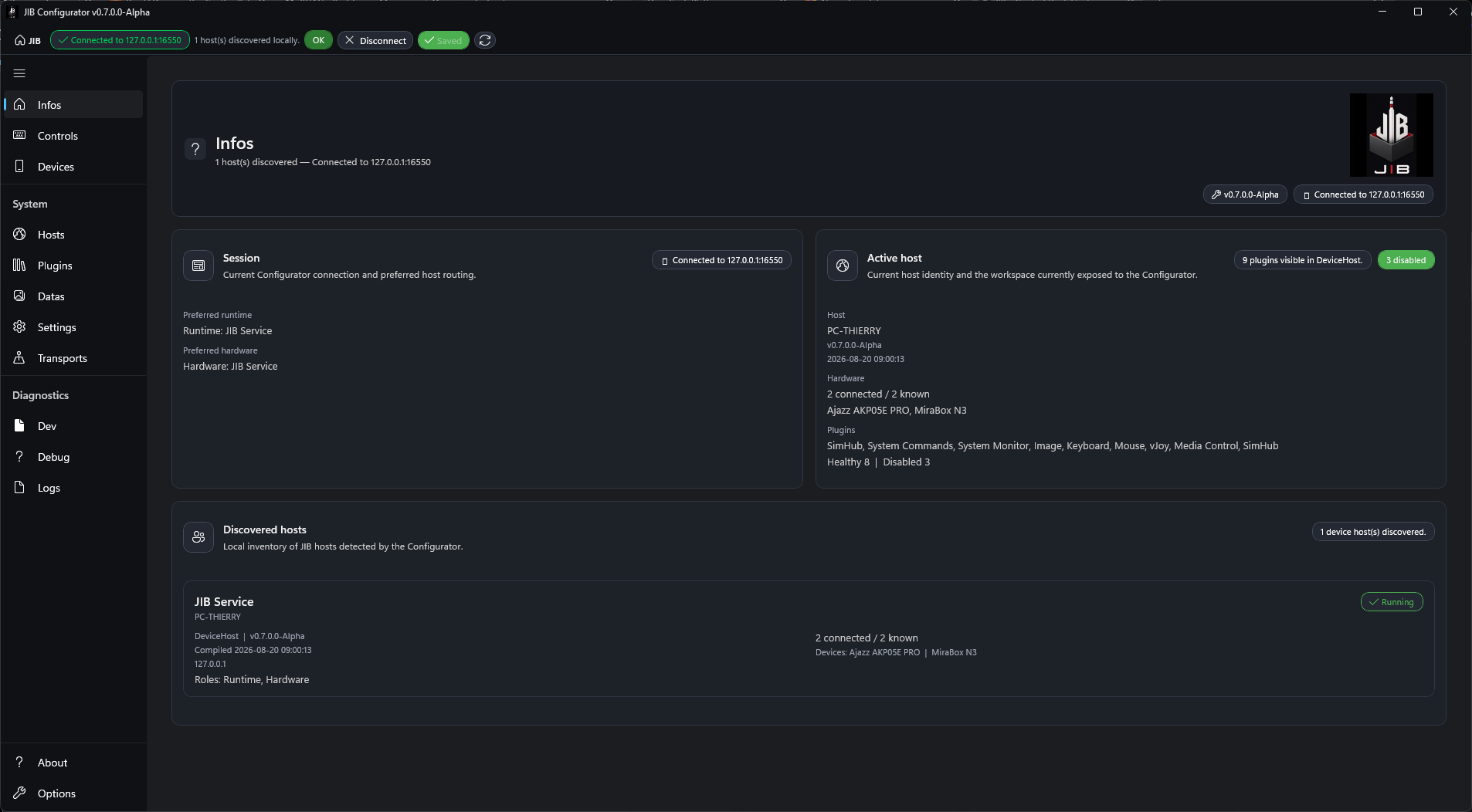
Infos is the connection and runtime overview. Its header shows the Configurator build version and the current connection status.
Use it to answer these questions before editing:
- is the Configurator connected to a host;
- which runtime and hardware route are preferred;
- which host is active;
- which devices and plugins are visible;
- whether a newer release is available.
The Update panel reports release availability and provides Open release and All releases buttons when update information is available.
The Session panel shows whether there is an active connection. When disconnected, it explains that a host connection is needed before runtime routing, active devices, and published plugins can be shown. When connected, it reports the Preferred runtime and Preferred hardware routes.
The Active host panel summarizes the connected machine, host version, hardware line, active device, active plugins, and plugin health detail. Header chips show the plugins summary and an overall plugin health chip.
The Discovered hosts area lists visible hosts with machine, version, endpoint, roles, hardware, workspace, and device information. Use this list to confirm that the host you intend to configure is the one currently visible on the network.
Devices Tab
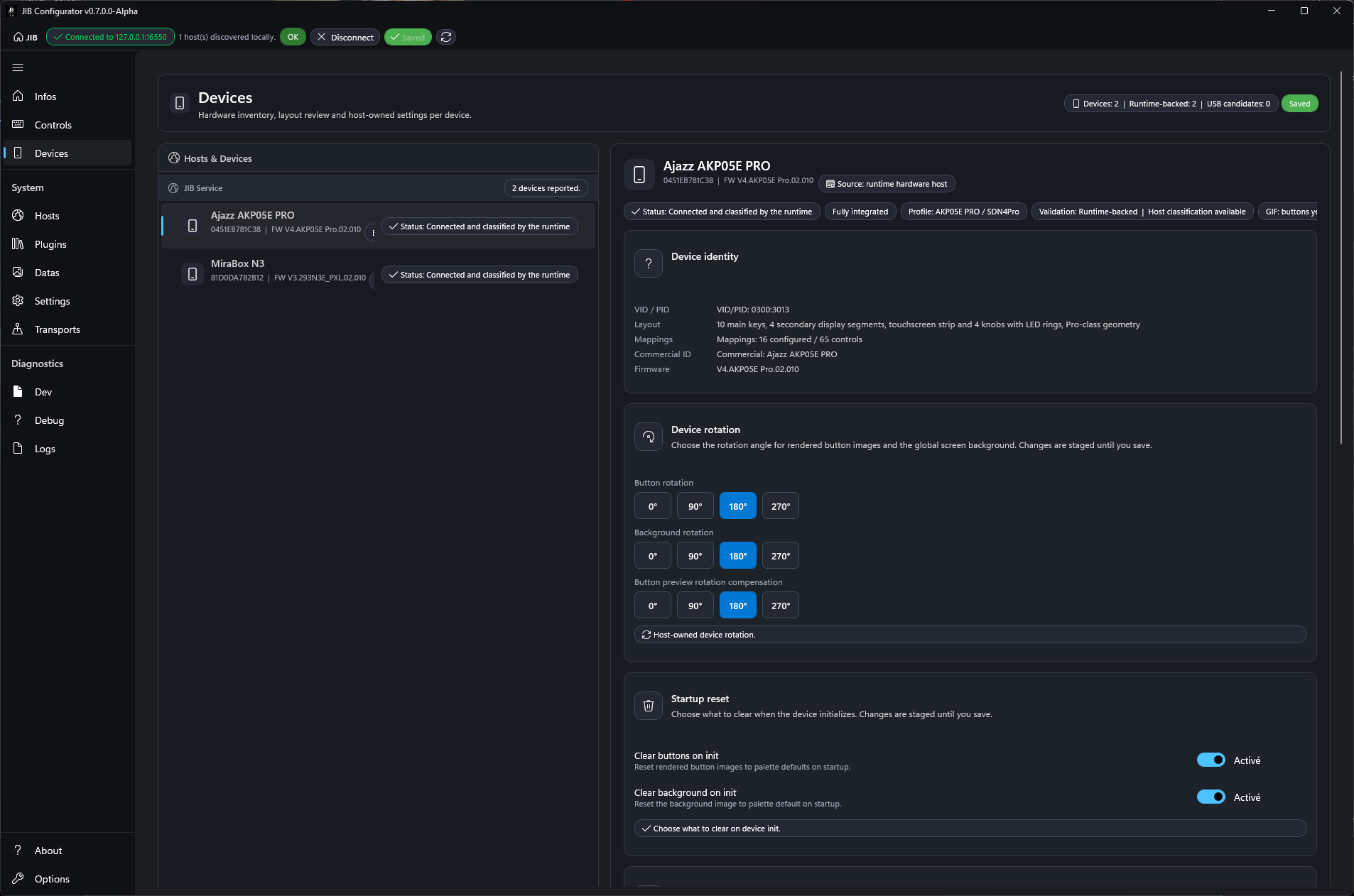
Devices is where host-owned settings for detected boxes are reviewed and edited.
Use it when:
- a box does not appear in
Controls; - a box is detected but the layout, serial, VID/PID, firmware, or commercial identity needs checking;
- rendered button orientation or background orientation needs to match the physical mounting;
- startup reset behavior needs to be changed;
- a persistent boot background should be written to the box;
- the per-device transport policy needs validation;
- host palette defaults need to be adjusted.
Select a device from Hosts & Devices. The detail panel then exposes:
Device identity: VID/PID, layout, mapping summary, commercial identity, and firmware version;Device rotation: separate rotation for buttons and background, when the device supports rendered buttons;Startup reset: whether buttons and background are cleared to palette defaults during initialization;Startup background: write a persistent boot background to the box ROM, applied immediately and surviving a reboot;Transport policy: the selected communication policy for supported StreamDock families;Palette: the per-device color palette, grouped by role.
The detail header shows status chips (status, support stage, hardware profile, validation, GIF capability, transport policy) next to the device identity.
The Palette section groups the per-device colors by role: Surfaces (Accent, Selection, Background, Panel, Border), Text (Text, Muted, Disabled), Title (Background, Text), Gauge & bar (Normal, Warning, Critical, Track), Trigger (Warning, Alert), and States (Good, Info, Off). Each color falls back to the built-in JIB default when left empty, and Export / Import save or restore the whole palette as a .jib-palette file.
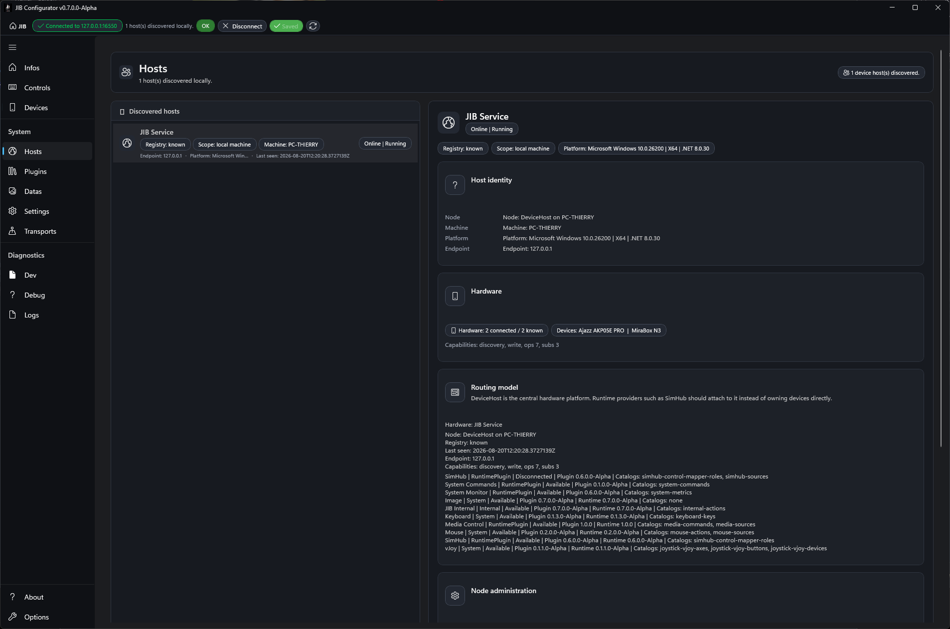
Hosts Tab
Hosts is the host discovery, host identity, node administration, and database management page.
Use it when:
- you need to choose or inspect a discovered host;
- you need to verify the host endpoint, platform, node, or machine identity;
- host hardware capability summaries need checking;
- a host node should be forgotten, banned, unbanned, or reset;
- the host database needs to be downloaded or uploaded.
The left side lists Discovered hosts. Selecting one opens the host detail panels.
Host identity shows node, machine, platform, and endpoint.
Hardware and Routing model summarize the preferred hardware, device-host node state, and binding providers.
Node administration contains host-level actions:
Reset settings;Forget node;Ban node;Unban node.
Use these actions deliberately. They affect the selected host node, not only the current Configurator window.
Database shows the host database state, affected items that may need review or remapping, the database path, and the Download database / Upload database commands.
Plugins Tab
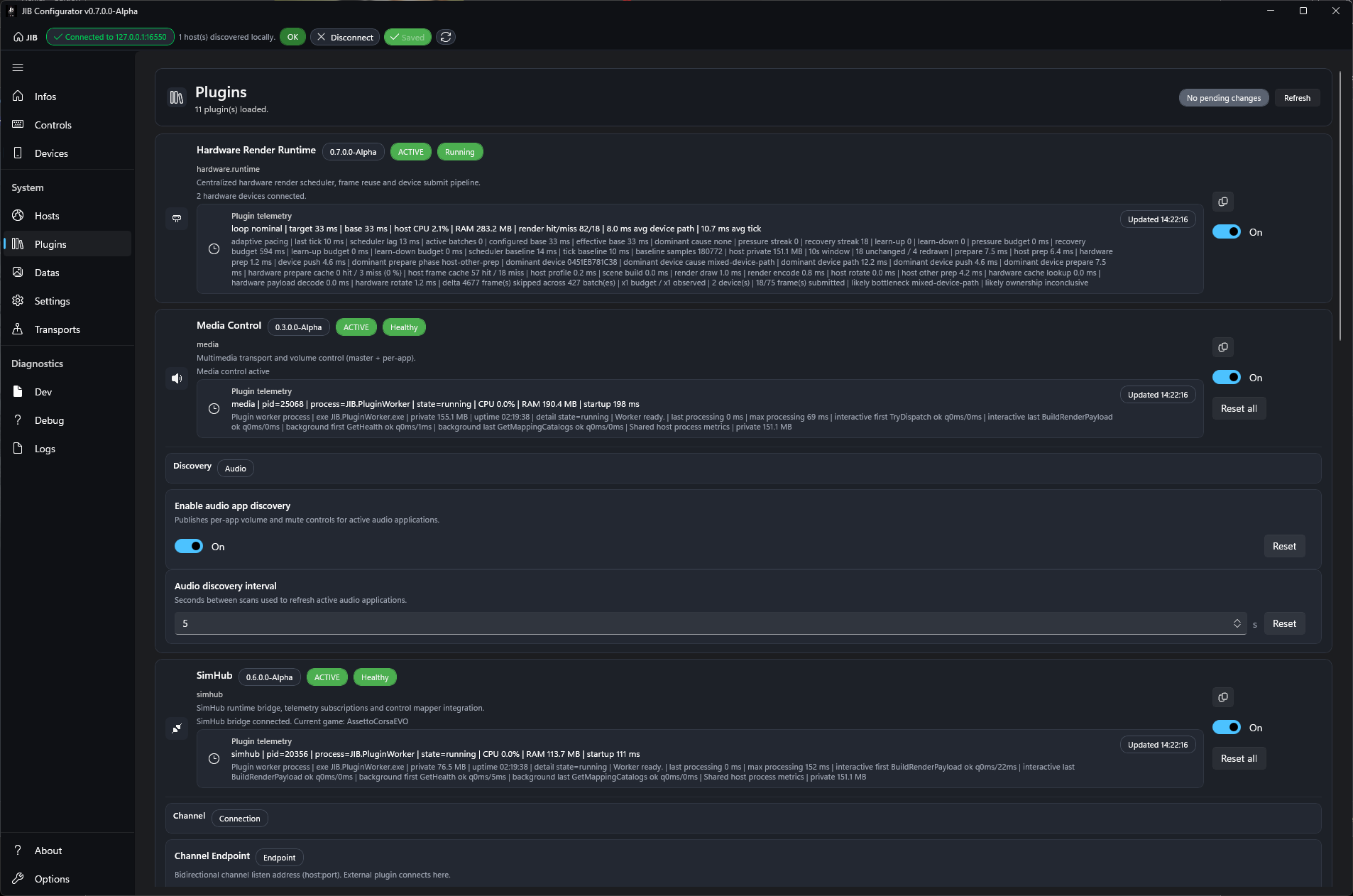
Plugins shows runtime plugin health, plugin telemetry, pressure status, and plugin-level settings.
Use it to:
- refresh the visible plugin list;
- confirm whether a provider is loaded, degraded, or failed;
- review runtime pressure reported by plugins;
- edit global plugin settings;
- reset plugin settings when needed.
The top runtime-pressure area summarizes whether any provider is reporting performance pressure.
Each plugin row can show:
- display name and provider id;
- description;
- status detail;
- failure summary, when applicable;
- telemetry summary and telemetry detail;
- runtime-pressure hint.
Editable settings appear inside the selected plugin area. Supported setting editors include text, endpoint, numeric, boolean, and secret-style fields. Secret values are write-only: the Configurator can report that a secret is configured without displaying the stored value.
Use Reset all only when you want to reset the visible plugin settings to their defaults.
Plugin configuration is global provider configuration. Concrete per-button behavior belongs in Controls, inside action cards and mapping metadata.
Datas Tab
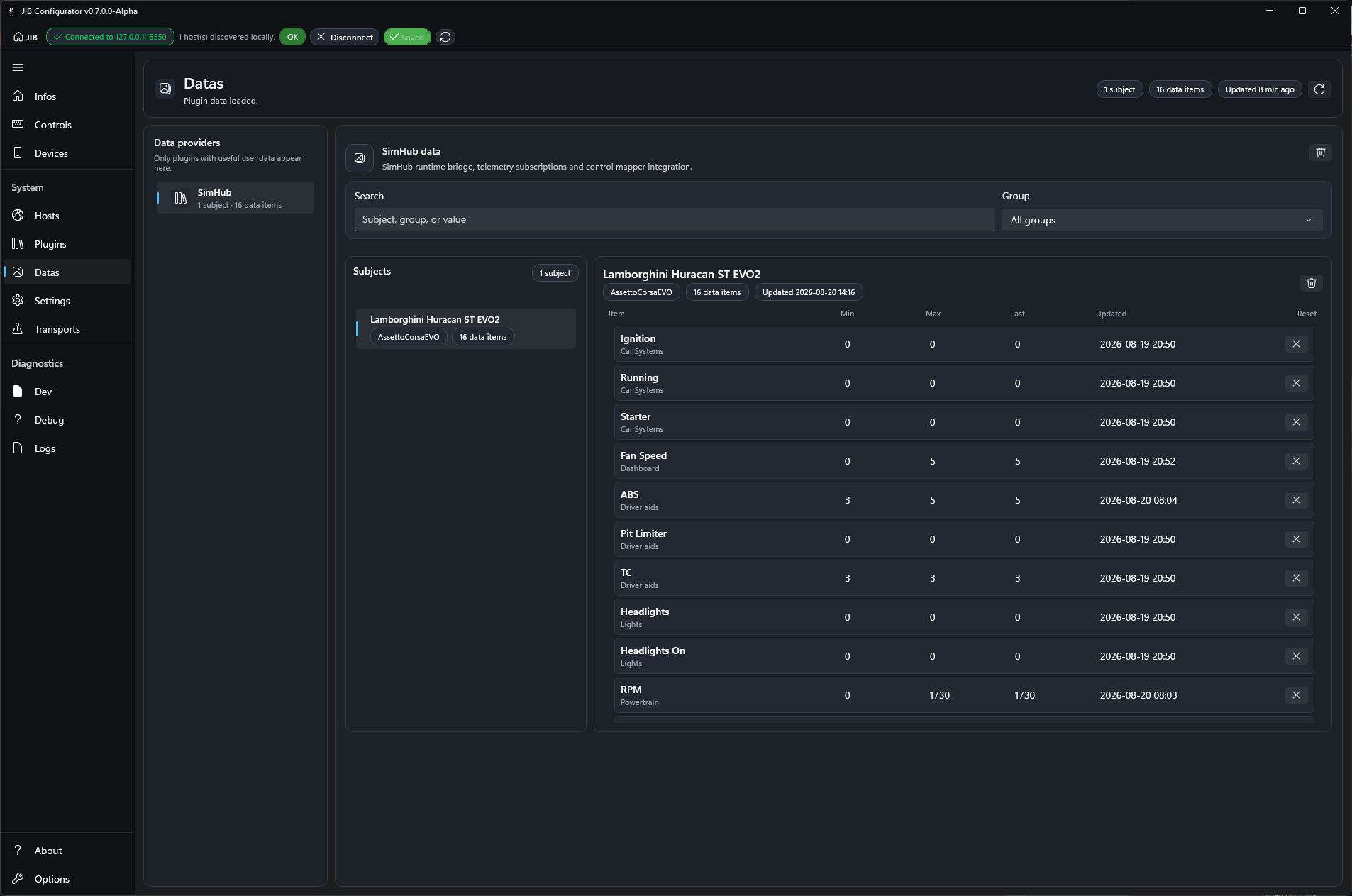
Datas browses user-visible data exposed by plugins.
Use it when a plugin publishes useful values that can help you understand what data is available for displays, actions, or diagnostics.
The left side lists Data providers. Only plugins with user-visible data appear there. If no provider appears, either no connected plugin exposes user data or the plugin has not produced data yet.
After selecting a provider, use:
Searchto filter by subject, group, or value;Groupto narrow the visible data group;- the
Subjectslist to choose the data subject you want to inspect; - the item list to review labels, categories, values, and reset information.
If the page says no plugin data matches the filters, clear the filters first. If it says to use the plugin and refresh the page, run the source application or plugin workflow that produces the data, then refresh.
Settings Tab
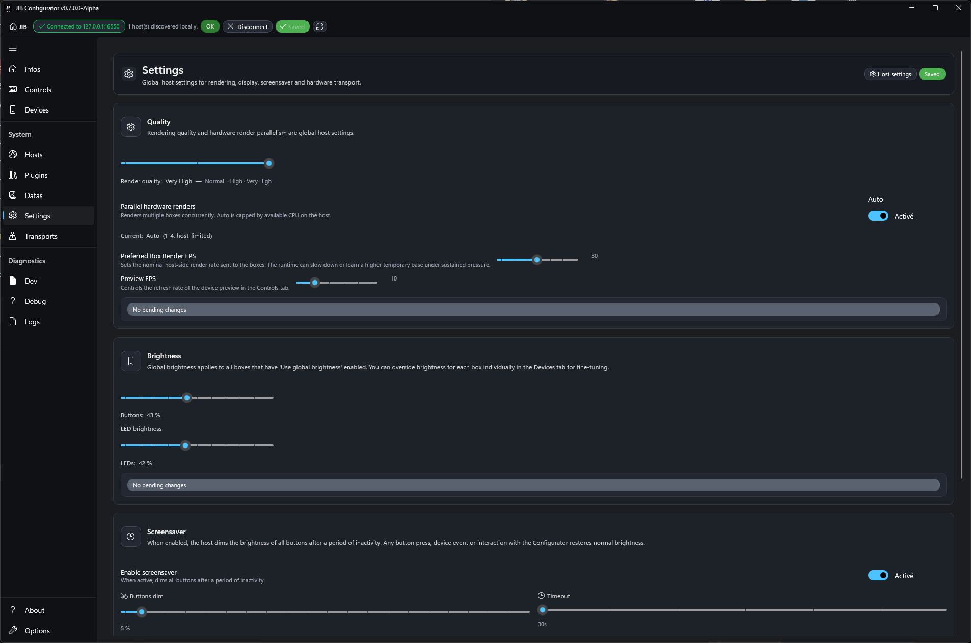
Settings contains host-level runtime tuning.
Use it when you need to change rendering quality, rendering cadence, brightness defaults, screensaver behavior, or host network reachability.
Quality contains:
Render quality: normal, high, or very high output quality;Parallel hardware renders: automatic or manual host-side parallel rendering;Preferred Box Render FPS: nominal render rate sent to boxes;Preview FPS: refresh rate of the device preview inControls.
Higher quality and higher FPS can increase CPU usage. If runtime pressure appears in Plugins or Debug, lower these values before changing mappings.
Brightness contains global brightness defaults for buttons and LEDs.
Screensaver dims buttons and LEDs after inactivity. It can be disabled entirely, or configured with:
- button dim percentage;
- LED dim percentage;
- idle timeout.
Network access controls whether the host accepts LAN connections. When Allow LAN connections is disabled, the host listens on 127.0.0.1 only. Enable it only when another machine must connect to the host.
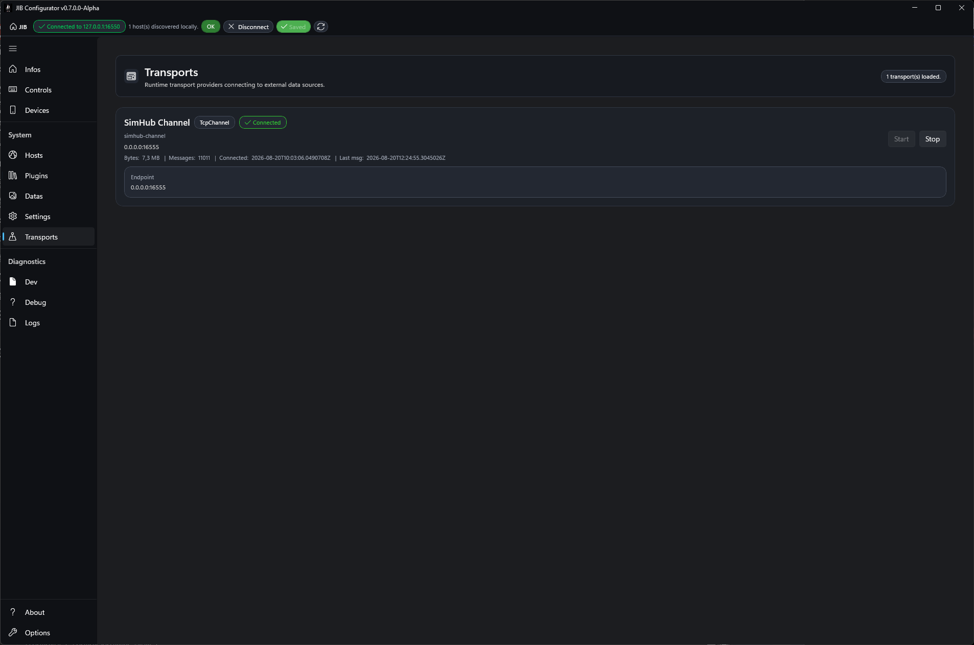
Transports Tab
Transports monitors live transport connections exposed by providers.
Use it when you need to confirm that a provider transport is started, connected, receiving messages, or reporting errors.
Each transport row can show:
- provider display name;
- provider id;
- endpoint;
- bytes received;
- messages received;
- connected time;
- last message time;
- last error, when present.
Use Start and Stop to control a transport when the provider exposes those commands. If a transport shows no messages while the related plugin is expected to be active, check the source application and the plugin settings first.
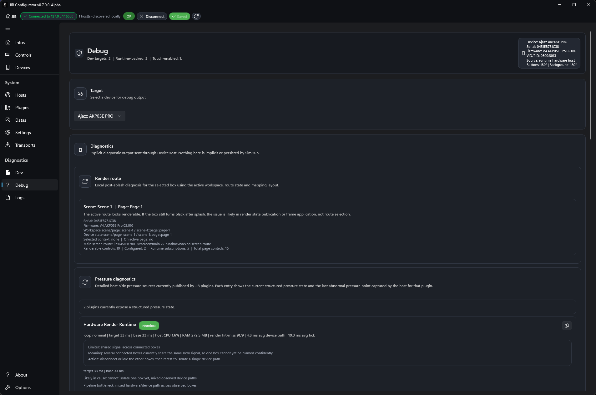
Debug Tab
Debug is the main support and diagnostics page.
Use it when hardware behavior, rendering, input routing, pressure, or host state needs investigation.
Start with Target: select the device whose debug output should be inspected.
Diagnostics includes:
Render route: shows how the selected device is expected to render;Pressure diagnostics: shows current or recent structured pressure signals;Diagnostic report: runs a guided diagnosis and can export a support bundle;Advanced diagnostic tools: copy/export commands and log-folder access;USB probe: USB interface and compatibility inspection;Box diagnostics: live validation for button order, LCD routing, touch-button LCD routing, brightness, and LED behavior;Diagnostic test pattern: temporarily pushes a selected test pattern to the selected box.
The Log section toggles verbose diagnostic categories:
- hardware LED trace;
- UI / mapping diagnostics;
- Controls preview diagnostics;
- hardware input diagnostics.
The Host section contains Reset all. This clears DeviceHost persisted settings, runtime mappings, provider cache, and active debug state, then restarts detection and initialization. Use it only when a full host-side reset is intended.
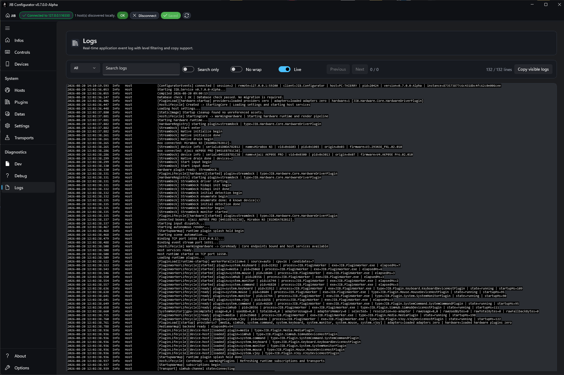
Logs Tab
Logs displays log output from the connected host.
Use it to review recent runtime activity without leaving the Configurator.
Available tools:
Search logs: search visible log text;Filter: show only matching lines instead of only navigating search matches;Wrap: wrap long lines;Live: keep the log view following live output;PreviousandNext: move through search matches;Copy visible logs: copy the currently visible log text.
When diagnosing a problem, reproduce the issue once, then use search terms related to the affected area, such as mapping, preview, LED, input, transport, or the plugin name.
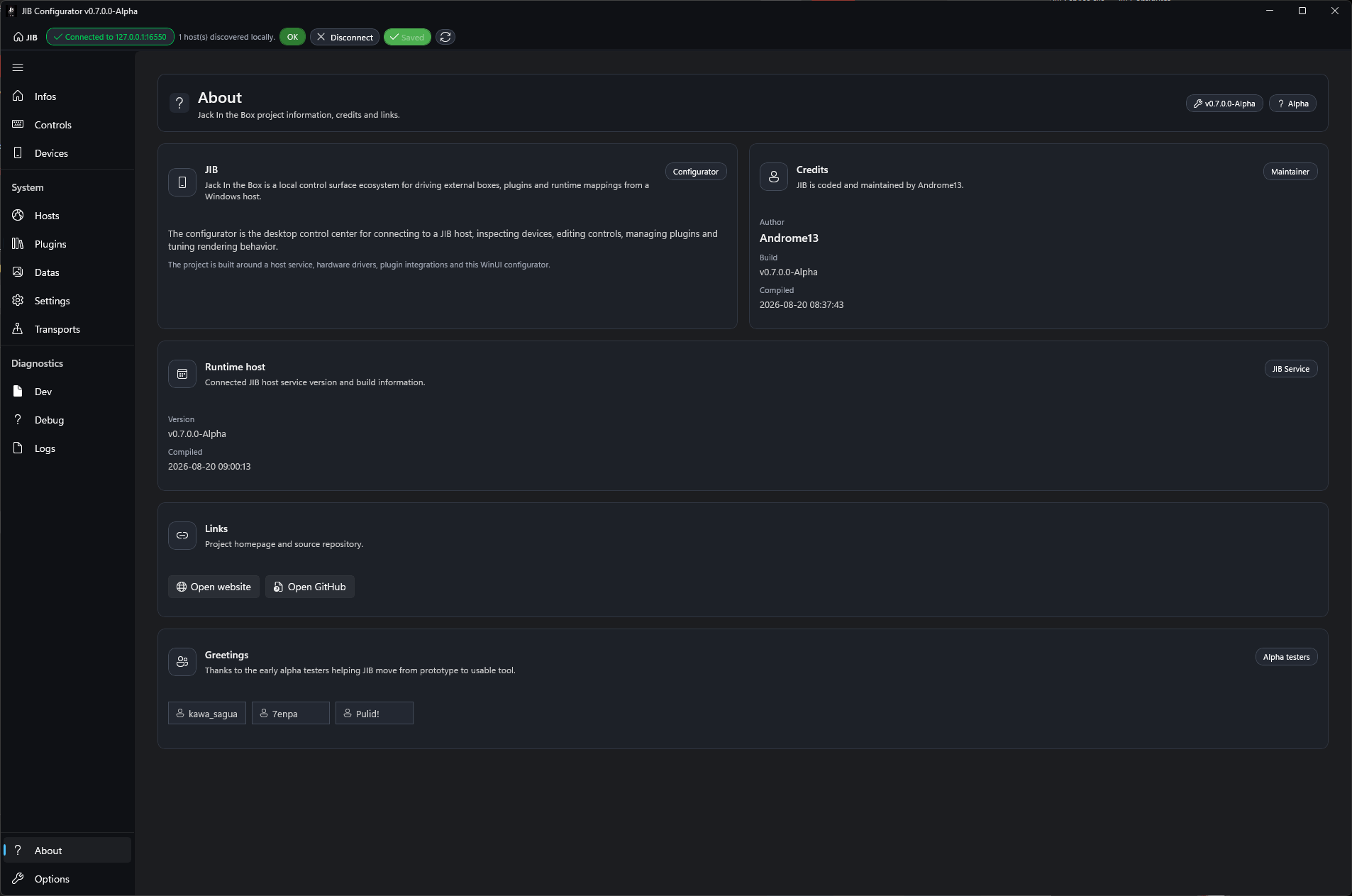
About Tab
About contains project information and links.
It summarizes what JIB is, shows the current Configurator build version, credits the author, and provides external links:
Open website;Open GitHub.
It also includes a greetings section for alpha testers.
Use this page when you need the installed build version or project links.
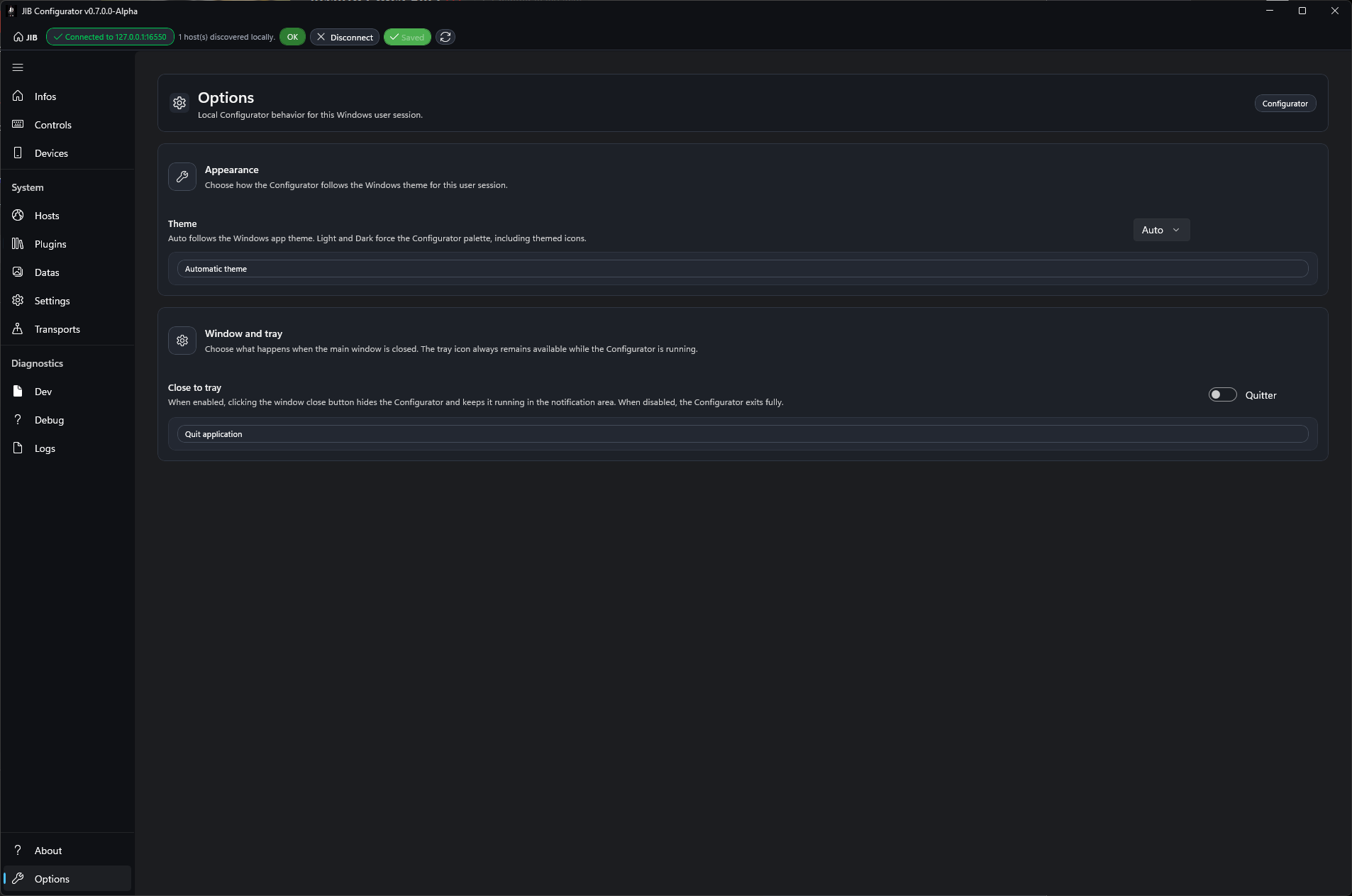
Options Tab
Options contains local Configurator preferences. These settings affect the desktop app behavior, not the host mappings.
Appearance controls the application theme:
Auto: follows the Windows app theme;Light: forces the light Configurator palette;Dark: forces the dark Configurator palette.
Window and tray controls close behavior.
When Close to tray is enabled, clicking the window close button hides the Configurator and keeps it running in the notification area. When disabled, closing the window exits the Configurator fully.
Quick Troubleshooting
| Symptom | Likely cause | What to do |
|---|---|---|
Controls is disabled | The Configurator is not connected to a host | Connect to a host from the header (see Connecting to a Host). |
No device appears in Device | No supported box is detected by the host | Check the Devices tab, the USB connection, and the host process. |
| Canvas is blank or stuck on loading | Workspace or hardware state is stale | Use Refresh, then verify the selected device is still connected. |
Events is blocked | No editable control is selected, or the control does not support mappings | Select a compatible control in the Canvas. |
Actions is blocked | No event slot exists or no event slot is selected | Create or select an event slot first. |
| A knob mapping cannot be edited | The knob is set to Button selected behavior | Switch Knob behavior back to Autonomous. |
| A display source has fewer options than expected | The selected control or hardware family has limited render capabilities | Try another control family or review the visible display-section guidance. |
Swipe left or Swipe right does not change touch page | Swipe selection edits the swipe mapping; it is not touch-page navigation | Use the touch-page selector or a runtime navigation action. |
| A saved change does not appear on hardware | Wrong device/page selected, stale preview, or host/device state lag | Refresh, verify the device and page, then check Infos and Devices. |
| Drag-and-drop from Explorer does not work | Configurator may be running elevated while Explorer is not | Run Configurator normally, not as Administrator. |
| Import does not apply | The target control structure does not match the exported mapping | Verify device, scene, page, touch page, folder, and control context before importing. |
Glossary
Action: an operation executed when an event fires. Examples include keyboard shortcut, program launch, page navigation, wait, mouse action, HTTP request, or plugin action.
Canvas: the central visual preview of the selected device. It is used to select controls and as the main drag-and-drop target.
Control: a physical or logical input/output element on a device, such as a button, knob, touch area, display surface, or swipe control.
Display: the runtime or static visual content shown by a rendered control.
Event: a trigger slot owned by a control. Actions are stored inside events.
Folder: a local sub-page entered from a page. Folders are navigation destinations inside the selected page structure.
Mapping: the saved relationship between a control event and one or more actions, plus related control display or behavior settings.
Page: a main layout page inside a scene, scoped to a single box.
Palette: the right-side browser for display sources, event slots, and actions.
Scene: a top-level layout owned by a single box. Each box has its own scenes, which can be selected manually or activated automatically by process rules.
Swipe: a logical control with two event slots (Swipe left = Decrement, Swipe right = Increment). The swipe mapping is per touch page.
Touch page: an alternate touch surface attached to the selected main page. Touch pages are not folders.
Workspace: the current host-side editing state, including selected device, scene, page, touch page, context, mappings, and provider data.